Be a leader, see a leader.
Orfit is worldwide one of the biggest players in the market of thermoplastic supporting products for radiation therapy, physical rehabilitation and prosthetics. Not really the type of product you can immediately visualize, but for us all the more interesting to dive into!
Orfit wanted to review their positioning and consulted us in how and if we could make improvements. Together with a team of Orfit we dove deep into their work field in a one day workshop. This workshop is prepared by us, but it’s interaction of the whole team during the day that always yields surprising insights for both us and the client.
After the workshop and analysis, a first need we saw was to develop a new brand architecture. To unlock the full potential of the Orfit brand, the company needed to look beyond their current market focus and see their core strengths. By placing Orfit as mother brand above the current market segments we created space and insight for innovation as well as more and better focus on the current market segments.
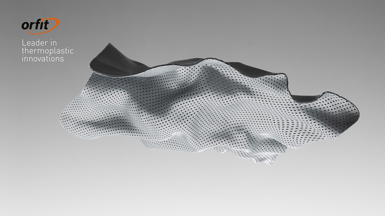
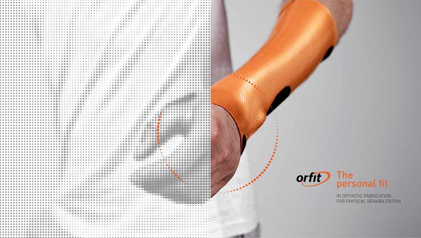
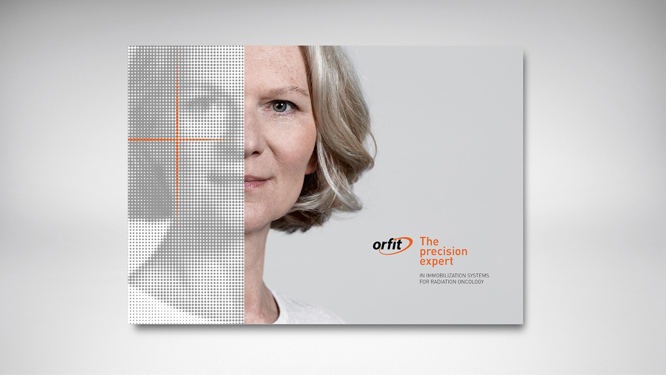
The mother brand Orfit was given the tag line ‘leader in thermoplastic innovations. The three (current) market segments each got their own positioning and tag line.
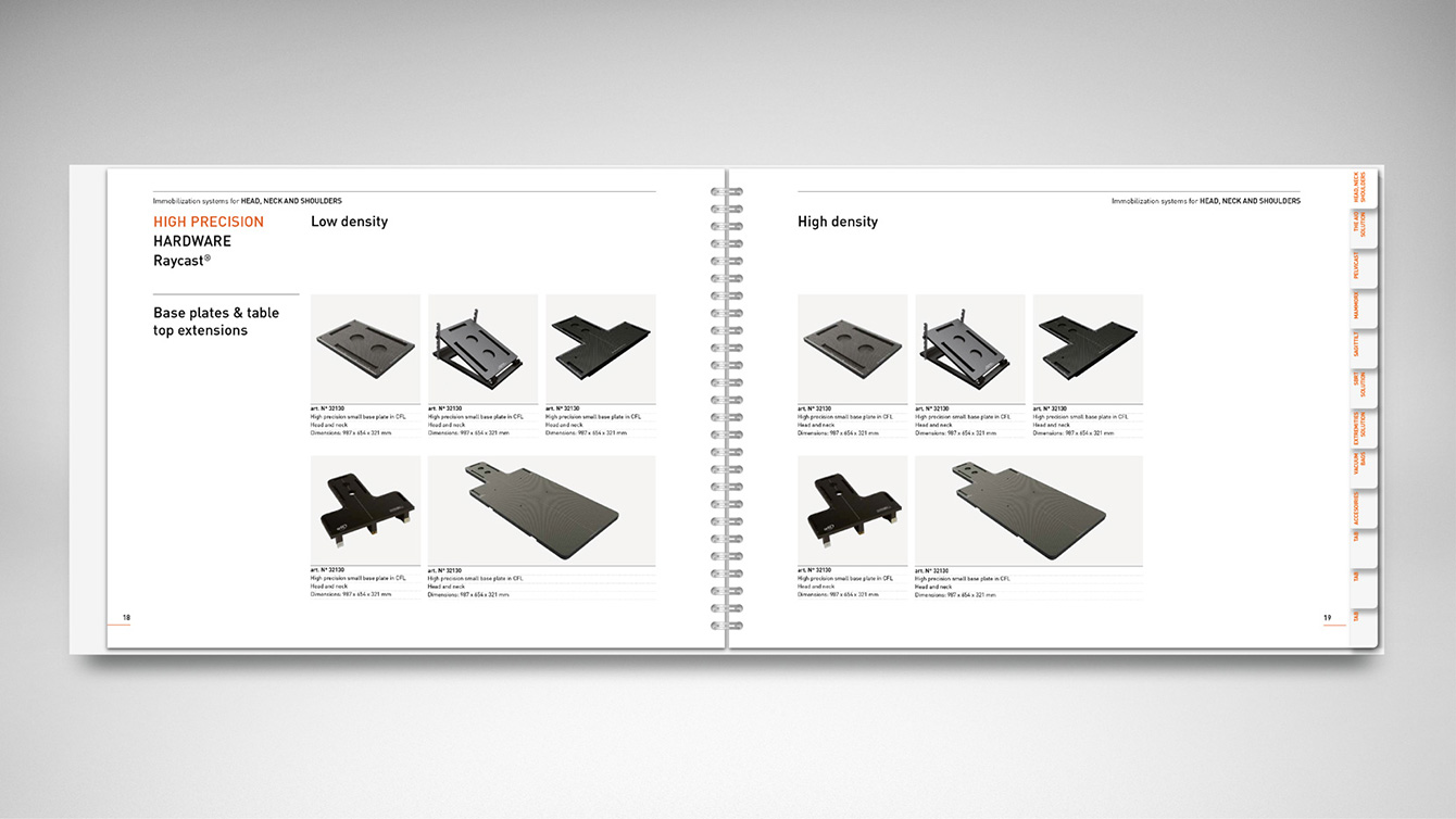
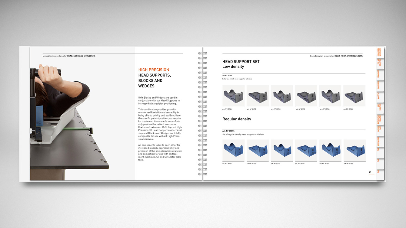
The next step was the translation into a visual identity. The logo remained unchanged at request and we worked mainly at a visual style to match Orfit’s focus on innovation and market leadership. The result is a light, airy style with elements referring to the typical holes structure of the thermoplastic material which forms the basis of all products. We developed a basic style and structure for the product catalogs and a new photographic style.
In addition to product photography, we create abstract figures of the material for a more artistic impression of the unique, multipurpose material. These artistic images immediately lift the image of Orfit to the the level of the market leader that they are and strengthens their innovative character.
Product photography by Frederic Uyttenhove.
Art photography by Frederik Vercruysse.
