Back on Track.
The acronym MAB stands for Environmental & Wastewater Technology and Soil Remediation, the specializations where the company started out with.
In recent years, MAB is more and more focused on sports infrastructure, where the first three knowledge areas are also very relevant. This development and the dated corporate identity were reason for an update.
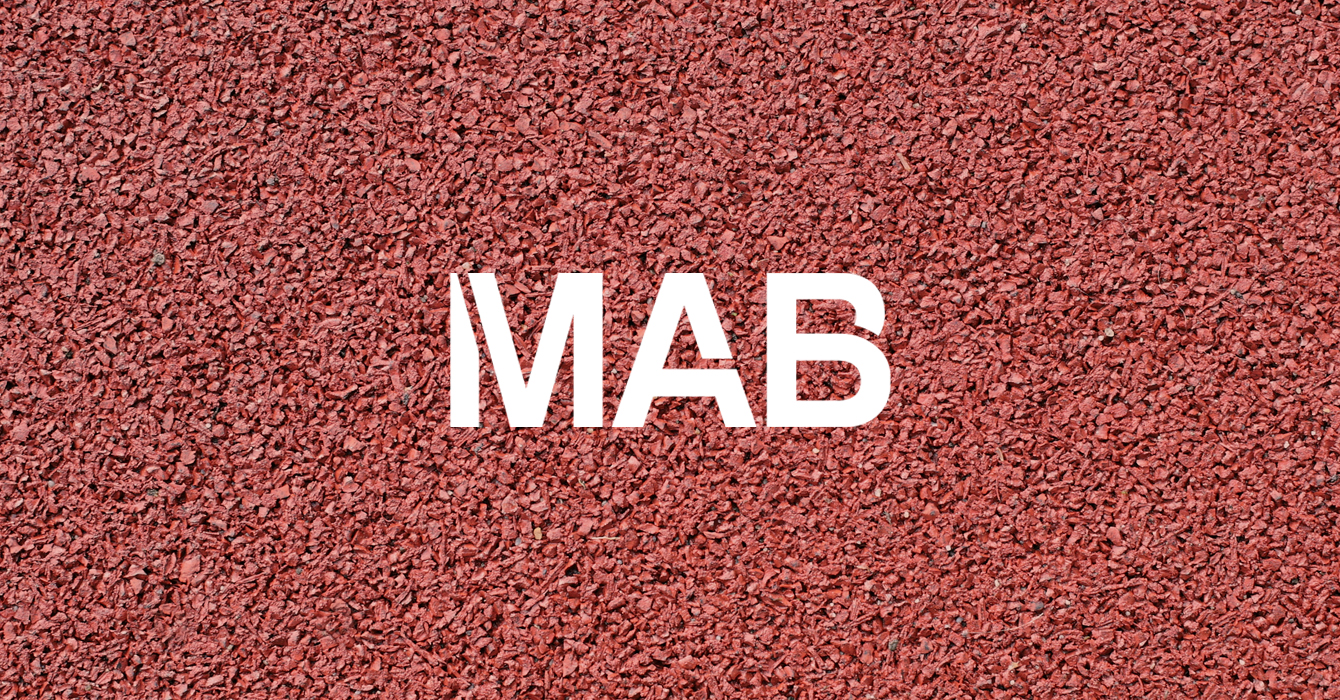
We wanted to preserve the strength of the logo, but give a more modern vibe. The new logo design was inspired by the lines and markings of sports fields and parking lots. These are common projects for MAB and thereby automatically provide a sense of recognition of the work they do. The lines furthermore also provide an dynamic to the logo that fits the spirit of the company.
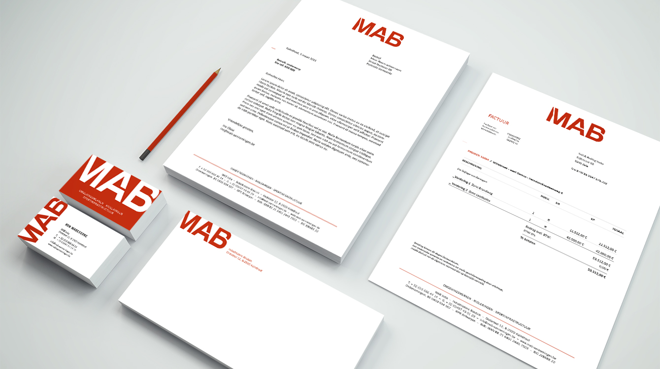
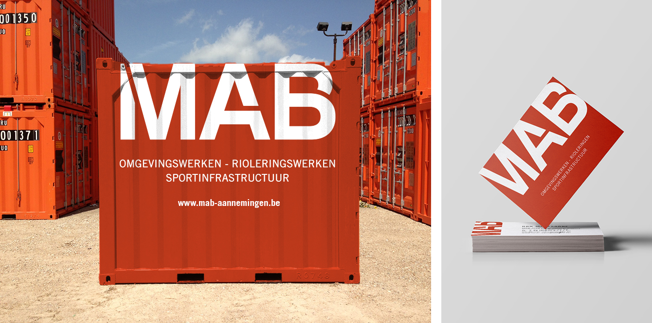
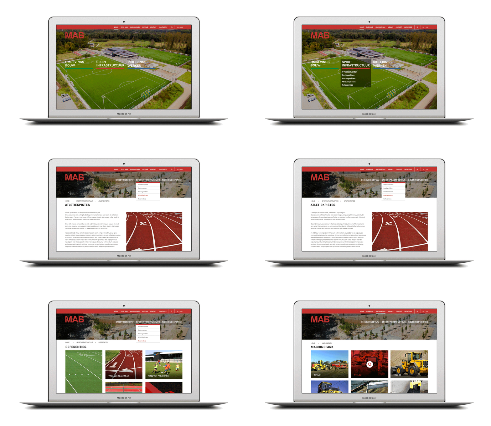
Each field got its own color code, but trracotta red was chosen as the main color. The new logo has a striking appearance and works well in different applications, such as the website, which also got a completely new structure and design.


