Smartly packed
Sometimes packaging needs to seduce, sometimes it needs to be practical. The latter was the case for this job for Eastpak, the brand in travel- and backpacks that has its origins in nowhere less than the U.S. Army.
These days Eastpak creates more than travel- and backpacks. The collection also includes a.o. shoulder bags, laptopbags and al lot of accessories.
Eastpak asked Flink to find a solution for the instore presentation of their range of laptop and tablet sleeves. The existing packaging couldn’t keep the sleeves positioned in the proper way, wasn’t tamper proof and didn’t communicate the Eastpak visual identity as it should.
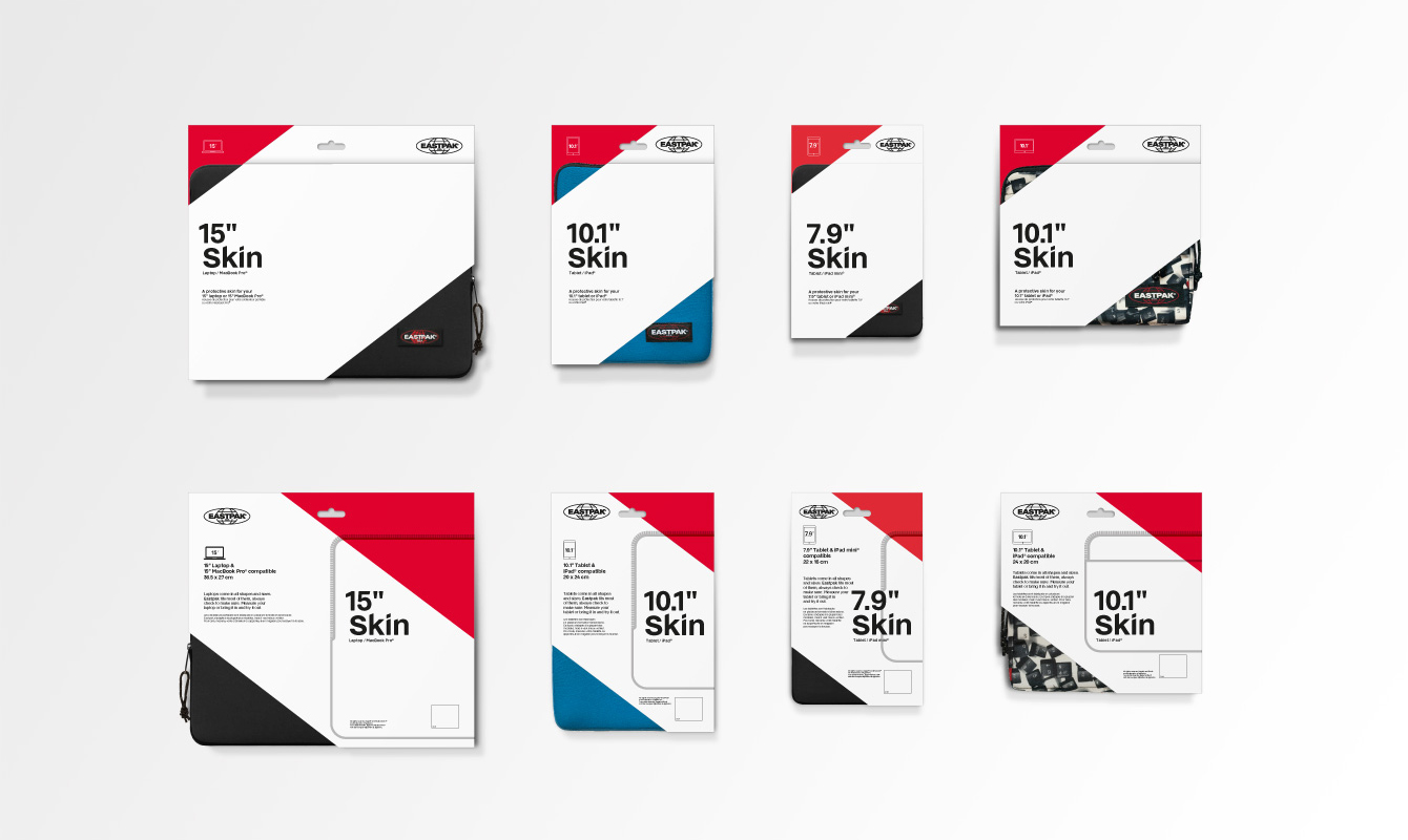
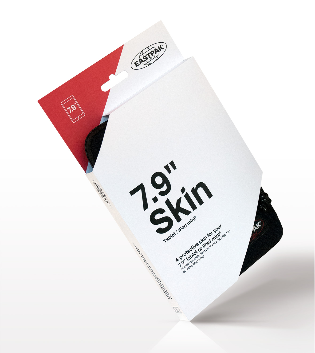
For this product, the attraction is of course in the sleeves itself: People want to feel the quality and see the different prints and colours. We designed a flat pack solution with a ’one-step-folding-system’ and integrated closure. We designed it in such a way that not only the sleeves were presented in a stable, proper way, but the open corners also display the sleeve’s specific features and finishing details (fabric, zipper, etc). At the same time it is also an efficient solution in production, shipping and assembly.
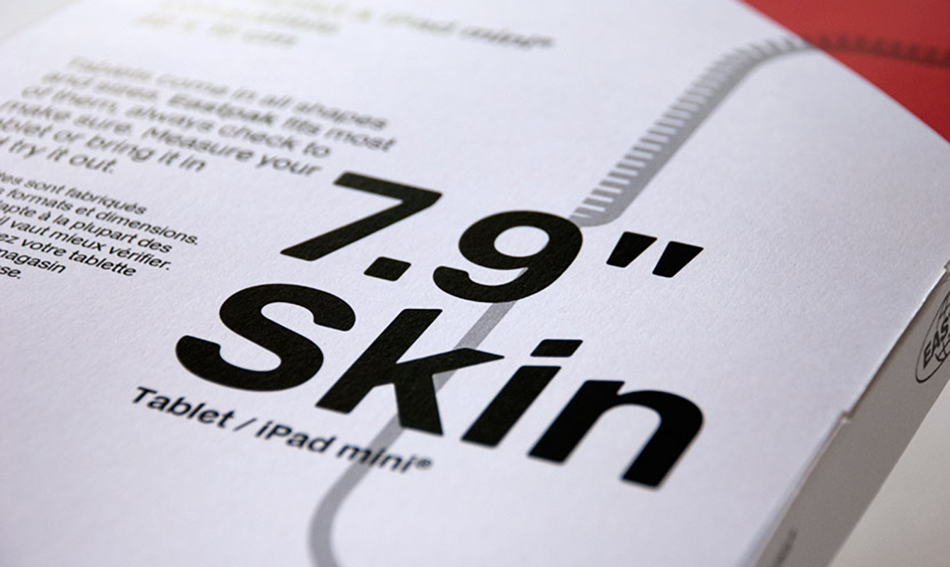
The graphic design is minimalistic and functional, indicating the device type and size in a consistent and clear way. A strong Eastpak brand signature is achieved using red accents and black typo only.


