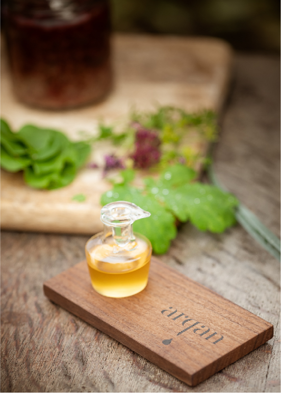
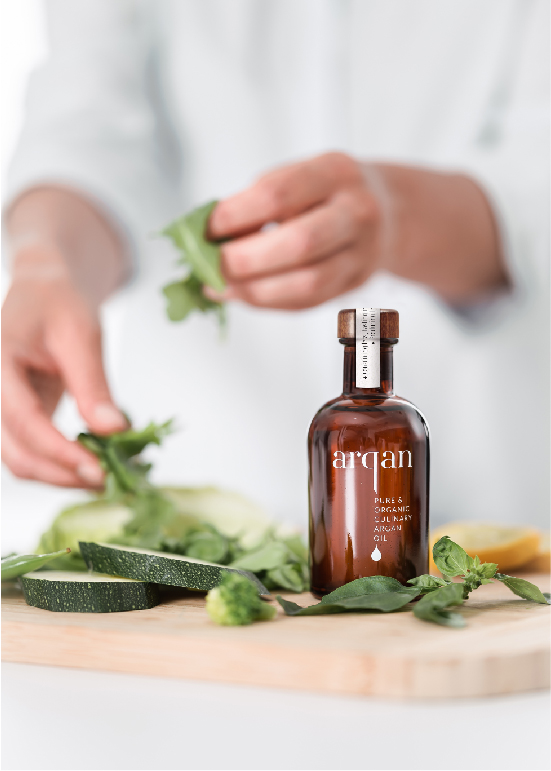
Liquid Gold
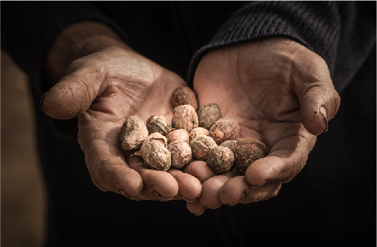
Culinary argan oil inspires chefs all around the world. But at Arqan, it is not just the remarkable flavour that matters, the origin of the golden oil is also important. That is why at Arqan they are committed to organic, sustainable and fair production. Arqan approached us with the request to translate their story into an appropriate corporate identity for argan oil. A story of luxury, with humble origins: the amber soil of Morocco.
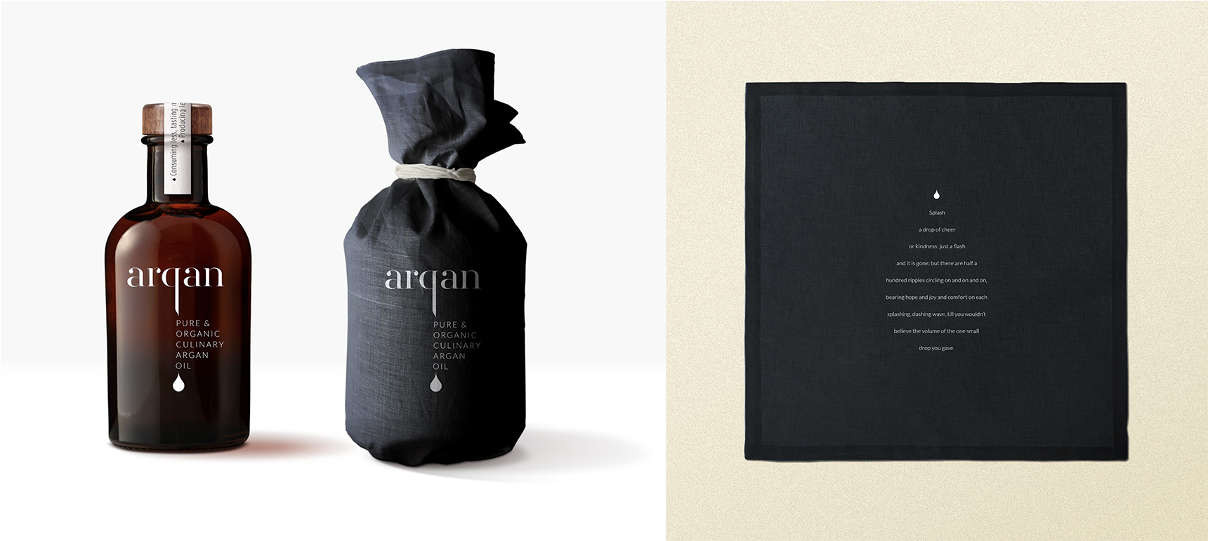
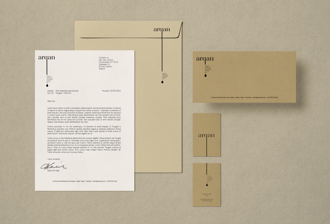
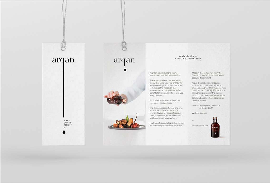
Every drop of the culinary oil counts. Not only because it is a precious commodity, but also because even the smallest addition creates a flavour explosion. The drop shape therefore became the basis for the entire corporate identity. A shape that recurs in a wide range of communication tools, which we varied for a playful touch.
The drop also forms a striking accent in the otherwise sober logo: a stylish and sleek Bodoni font with stylised q.
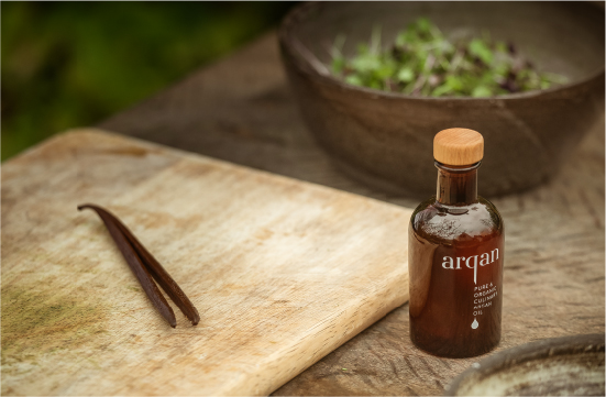
The amber-coloured bottle is a direct reference to the Moroccan soil where the argan trees grow, near Agadir.
To emphasise the value of the contents, we chose a luxurious sleeve as well as a linen cloth to wrap the bottle. The cloth features texts that inspire in the kitchen.
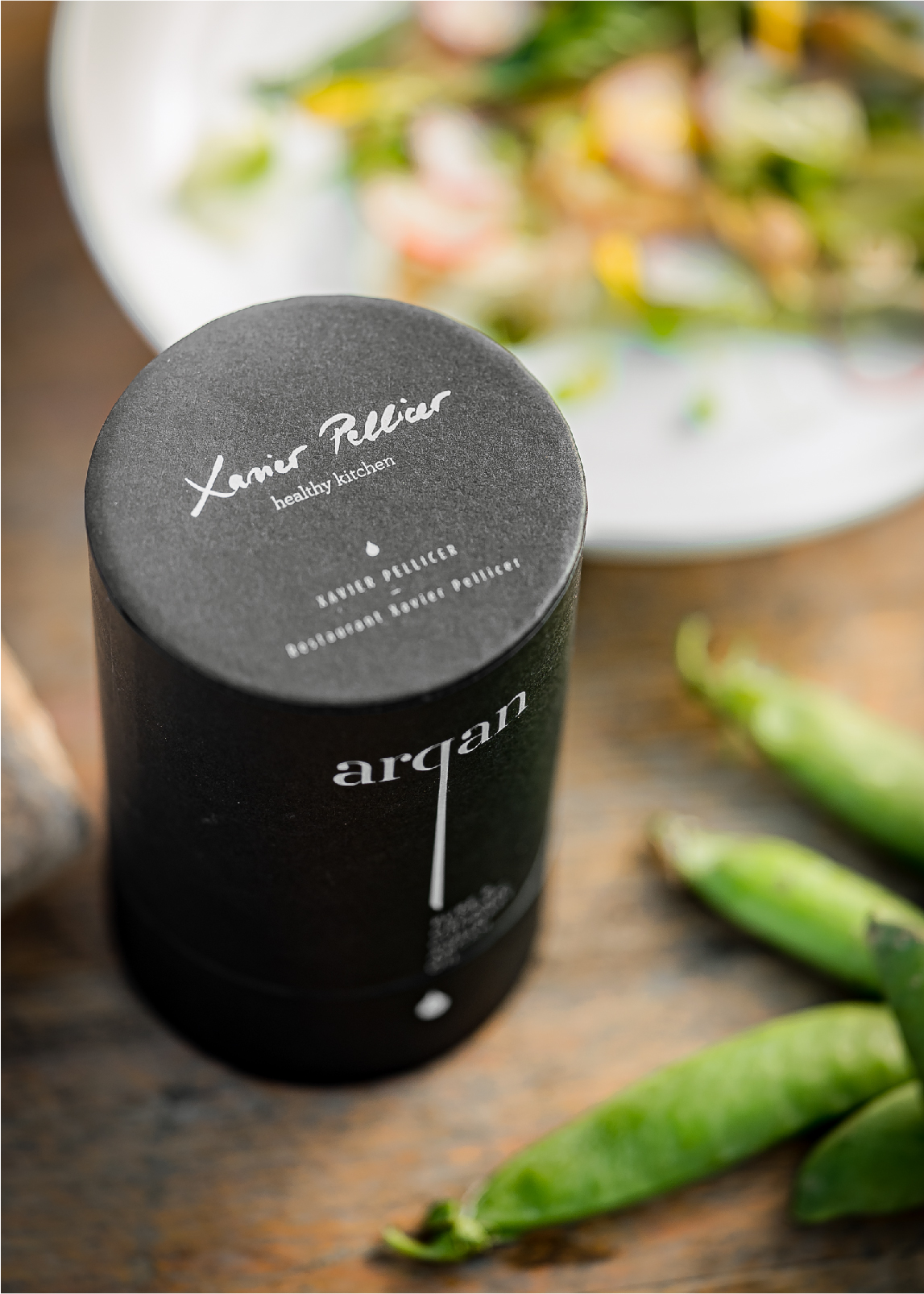
On the tube, each Arqan ambassador —chefs Frank Fol, Xavier Pellicer, Luc Kusters and Marcel Thiele— was given their own signature. Finally, we also created miniature leaflets with recipes to add randomly to the Arqan bottles.
Photographie by Wim Demessenmaekers