'Modern Vintage'.
Jules Destrooper is a worldwide Belgian cookie brand with origins dating back to 1886. In 1889 Jules Destrooper decided to market a traditional West Flanders cookie, a butter crisp nicknamed ‘Lukken’. The butter crisps were traditionally baked at the beginning of the year and given as a New Year’s ‘Best Wishes’ gift. In Dutch, Happy New Year is ‘Gelukkig Nieuwjaar’, hence the nickname ‘Lukken’.
The design challenge was to construct a modern interpretation of the tin box that would reawaken the sentiment surrounding the original paper-labelled box, and more importantly, close the brand’s image gap between generations. Even though the younger generation recognises the brand’s quality, the brand love and awareness is much less intense compared to older generations.
In Belgium Jules Destroopers’ cookies are celebrated in West Flanders where the ‘Lukken’ is a true icon. In the old days and until the mid-eighties the cookies were manually packed in tin boxes and sealed with paper labels. But this way of packaging became too expensive to maintain considering the volumes that were being sold and due to the industrialisation of baking and packing, tin boxes were replaced by cardboard boxes and plastic and foil interiors.
To celebrate the 125th anniversary of the Lukken, the brand decided to reintroduce the famous tin box. The idea was to recreate 125 original hand-wrapped paper versions, and a modern interpretation to sell on a larger scale.
Since the 50+ years old remembers the old paper box, but 25-45 year olds have no recollection of it, the idea was to find an idea that could breathe new life into the story for older generations and introduce it in a seductive way for younger generations.
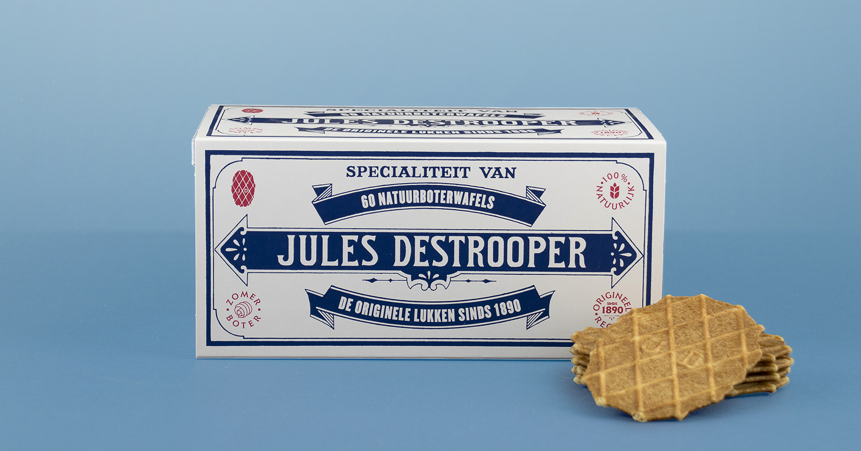
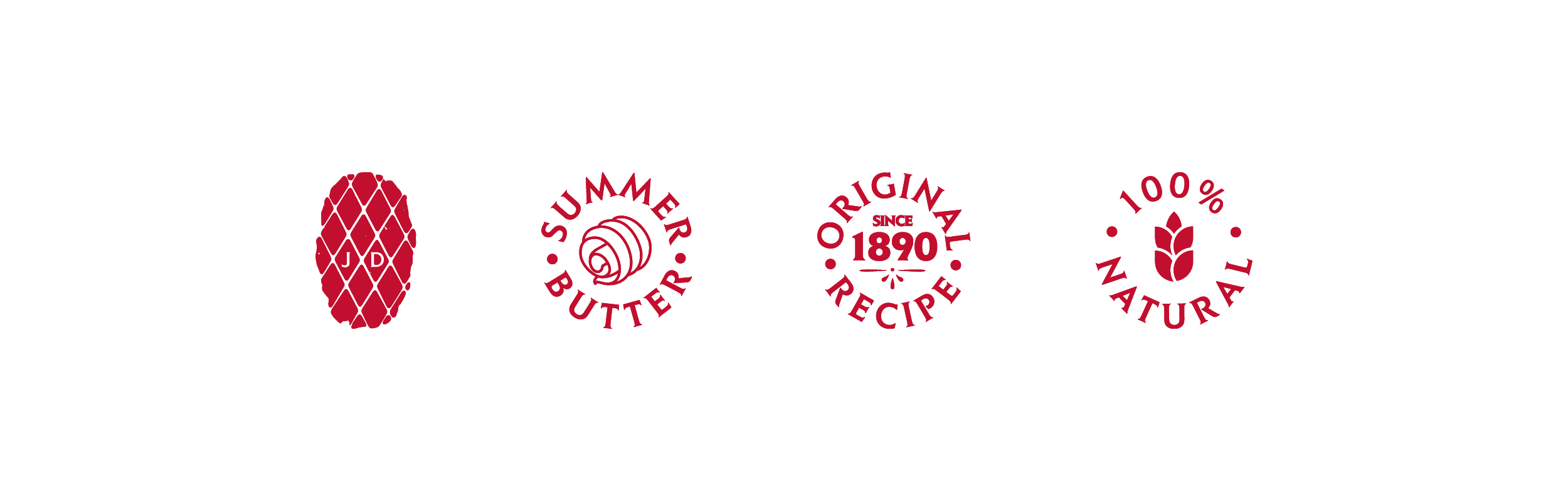
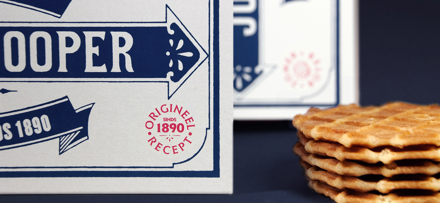
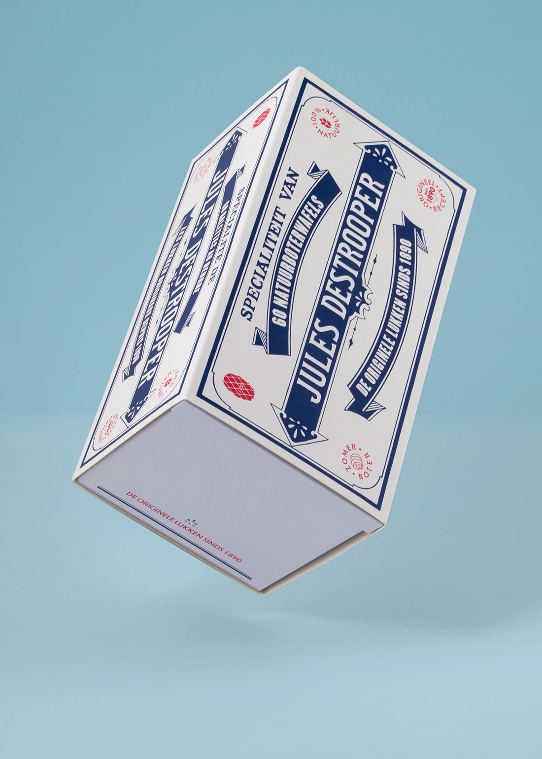
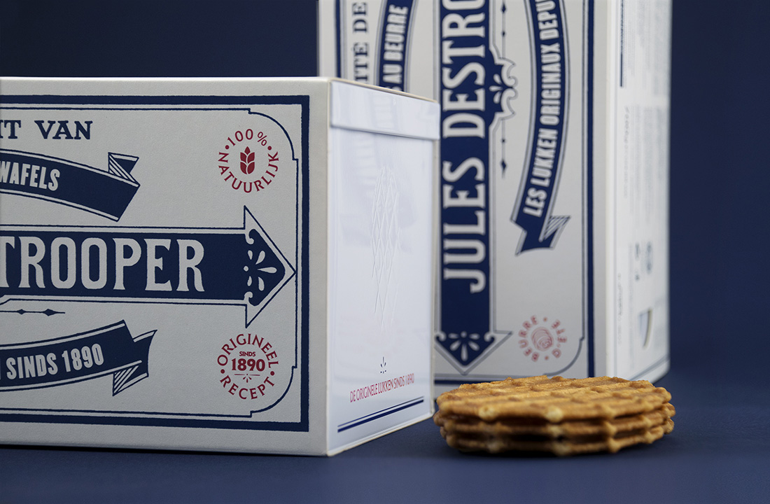
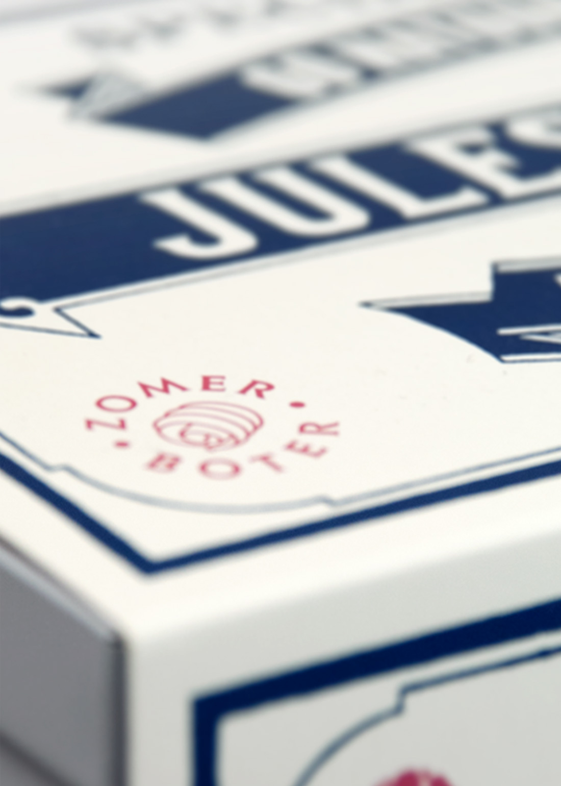
By scanning and cleaning up the original paper labels, we gave it a sleek modern look. Next to the iconic blue and white colours of the original packaging, we used the red of the packaging date that was on the original tin box to emphasise relevant new messages that we wanted to add: natural ingredients, for example, butter crisps are made with only summer butter, and the message that butter crisps are still made according to the 125-year-old original recipe.
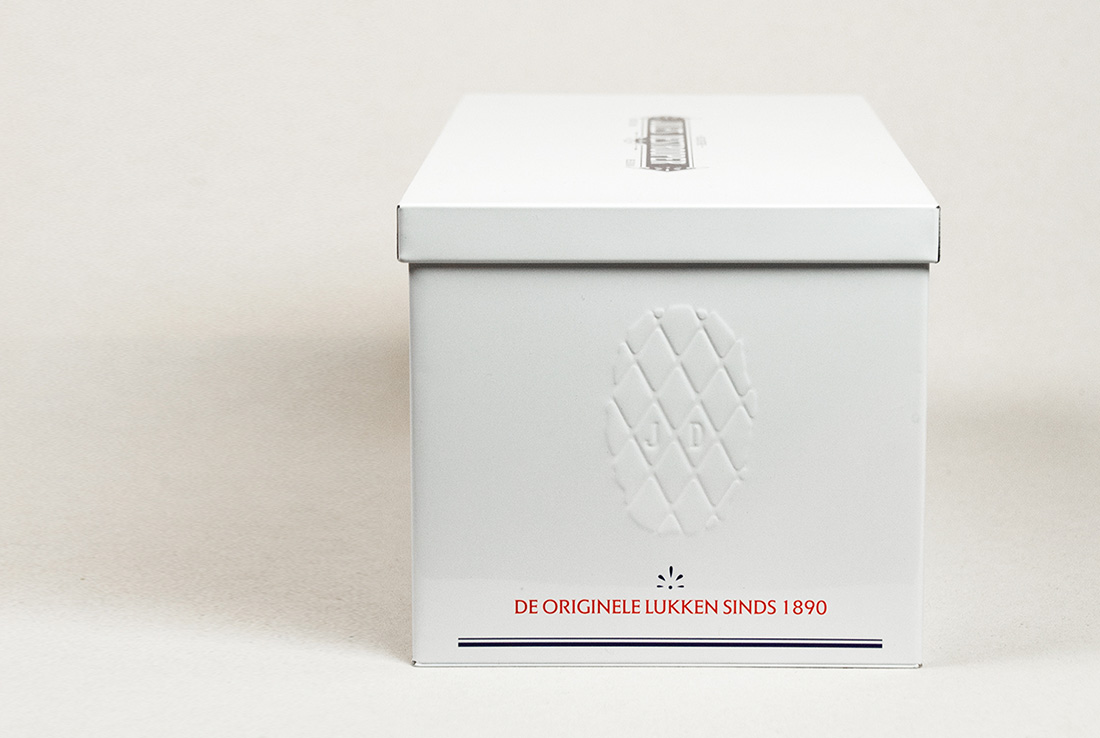
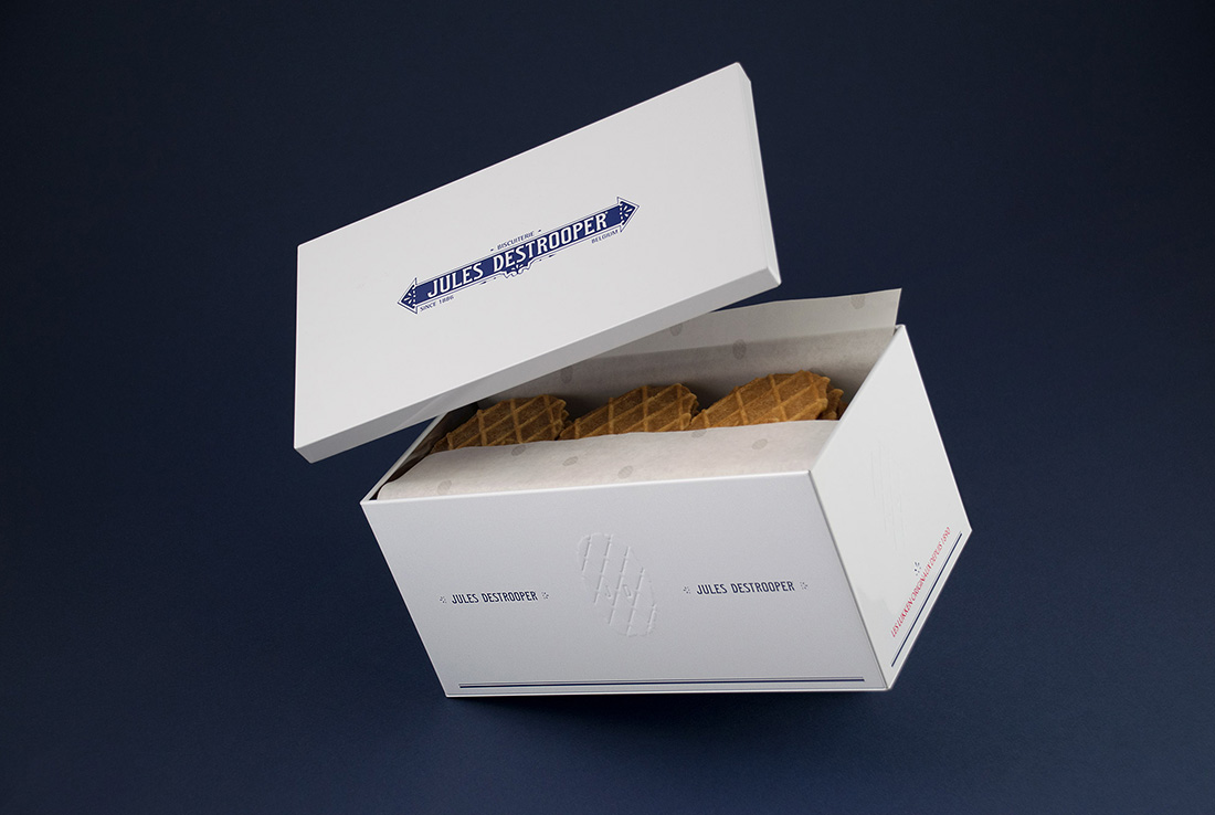
Although the need for branding was obvious, we wanted the tin box to be so appealing that it would become a must-have item for every kitchen. Therefore it could not be too commercially branded. We chose a minimalistic design using signature Jules Destrooper white with only subtle blue branding and design elements. To promote and celebrate the recognisable ‘Lukken’, we transformed it into a chic embossed icon on the tin box.
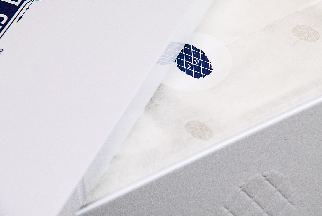
To add the feeling of craftsmanship that pairs naturally with homemade cookies that is lacking in most large-scale industrial packaged goods, we added a finely-printed butter paper to cover the foiled-packaged cookies. This gave a feeling of craftsmanship and authenticity when opening the box. The ‘Lukken’ brand story was printed on the lid, marking its place in this unique piece of history.
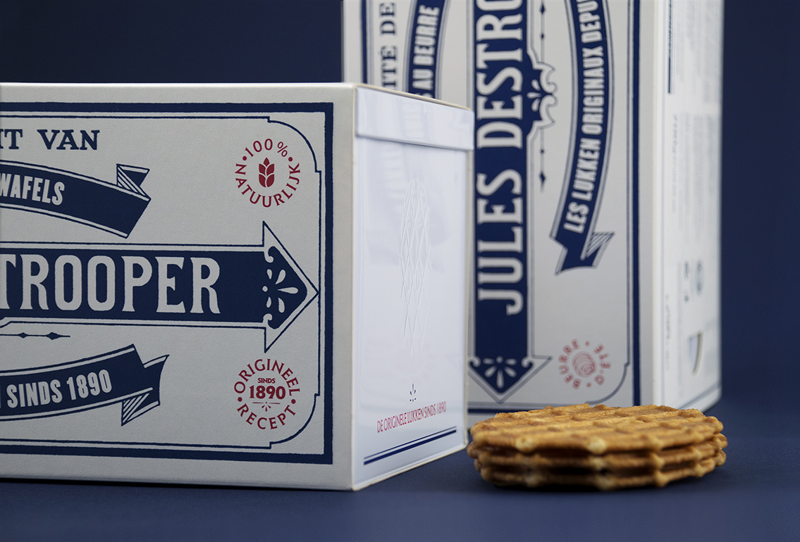
We chose a textured paper sleeve of slightly coarse paper to cover the tin box — a nostalgic nod to the old vintage box, as well as providing the necessary brand recognition for in– store shelf visibility. With the choice of paper and updated original label design, the sleeve enhanced the overall modern/vintage feeling that we wanted to achieve.
The boxes sold out quickly. Truth be told, we bought quite a few for ourselves as gifts for clients and partners. We even had a relation that had received the tin box as a new year’s gift already! Everyone who receives a box is immediately impacted as the design touches the hearts of young and old — just the way we intended.