Jump around!
There is something magical about jumping on a trampoline, the sensation of weightlessness is fun for both adults and children.
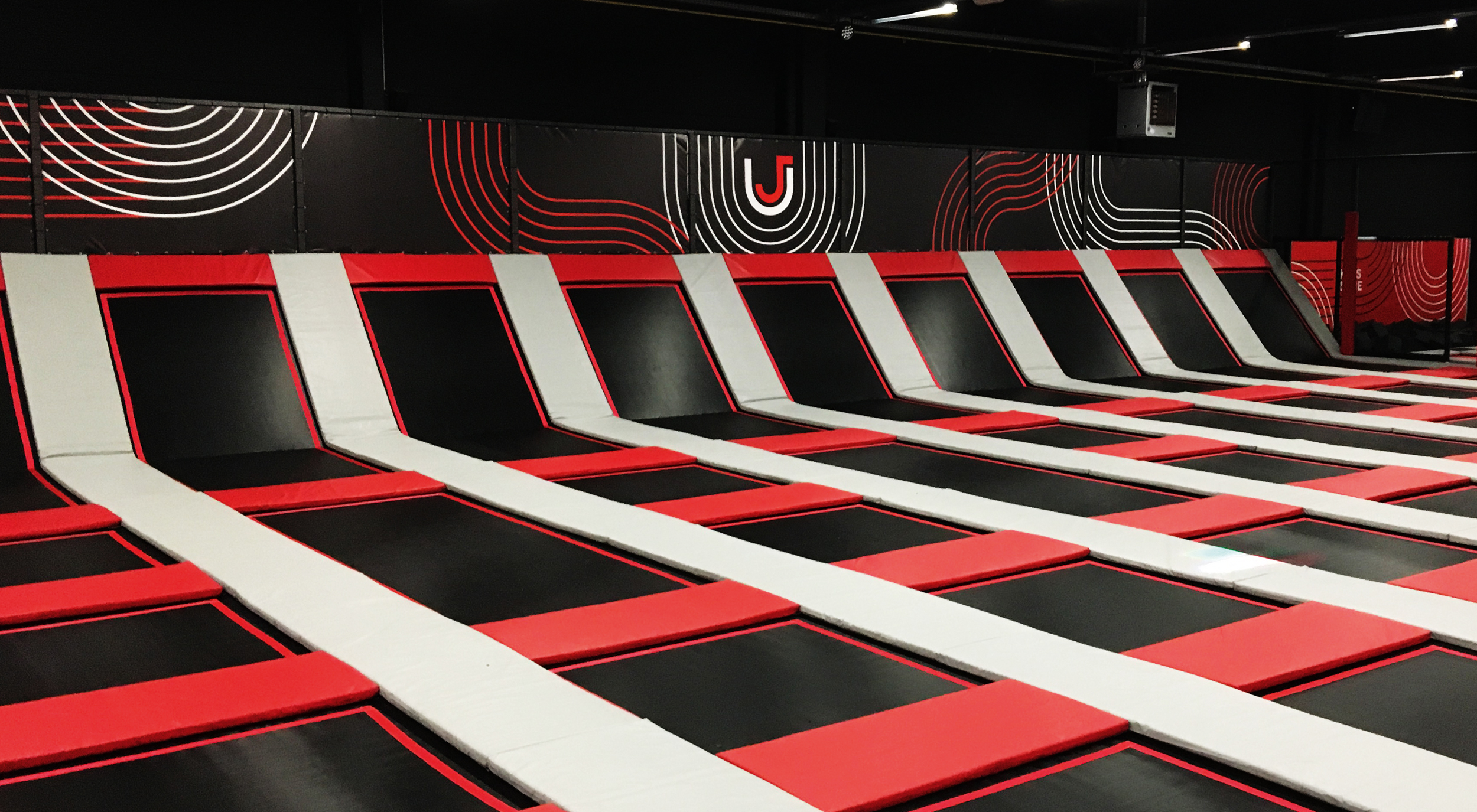
Jump Univerz has recently opened its first branch in Antwerp and plans to open several more locations. This was an important starting point for its brand identity. The supporting red colour will be customised to the specific locations giving each its own distinctive appearance.
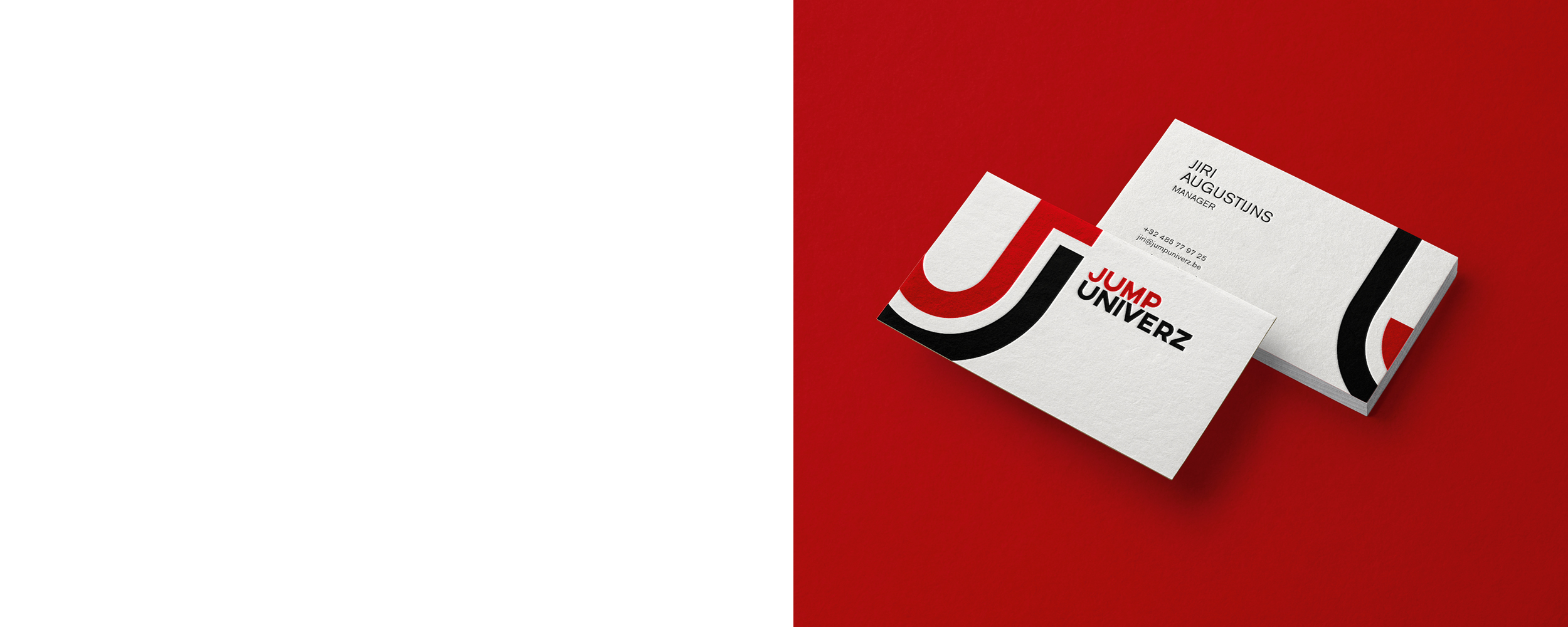
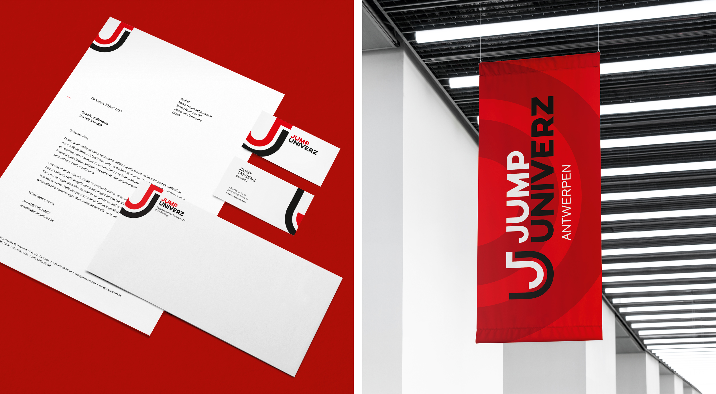
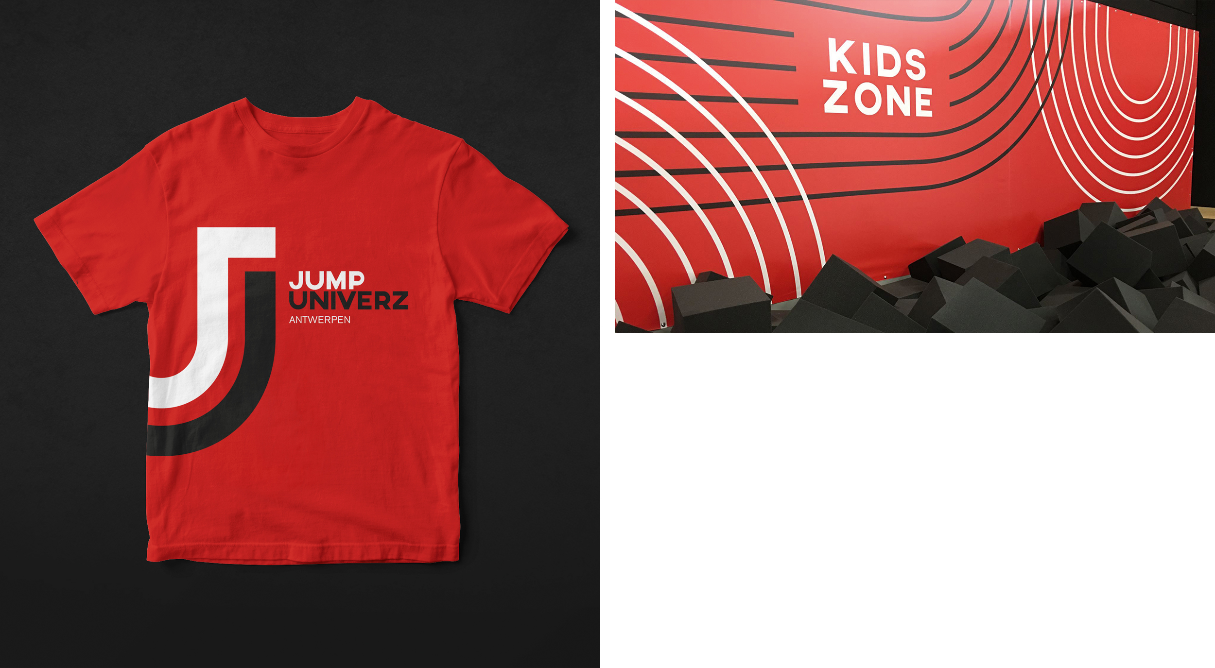
We developed a recognisable icon using the ‘JU’ which can be used as a stamp on various applications. It is a playful element that can also provide the necessary impact. What’s more, the identity was given playful lines to bring the dynamics of trampoline jumping into the look and feel.
Time to start practising your somersaults: jumpuniverz.be !
