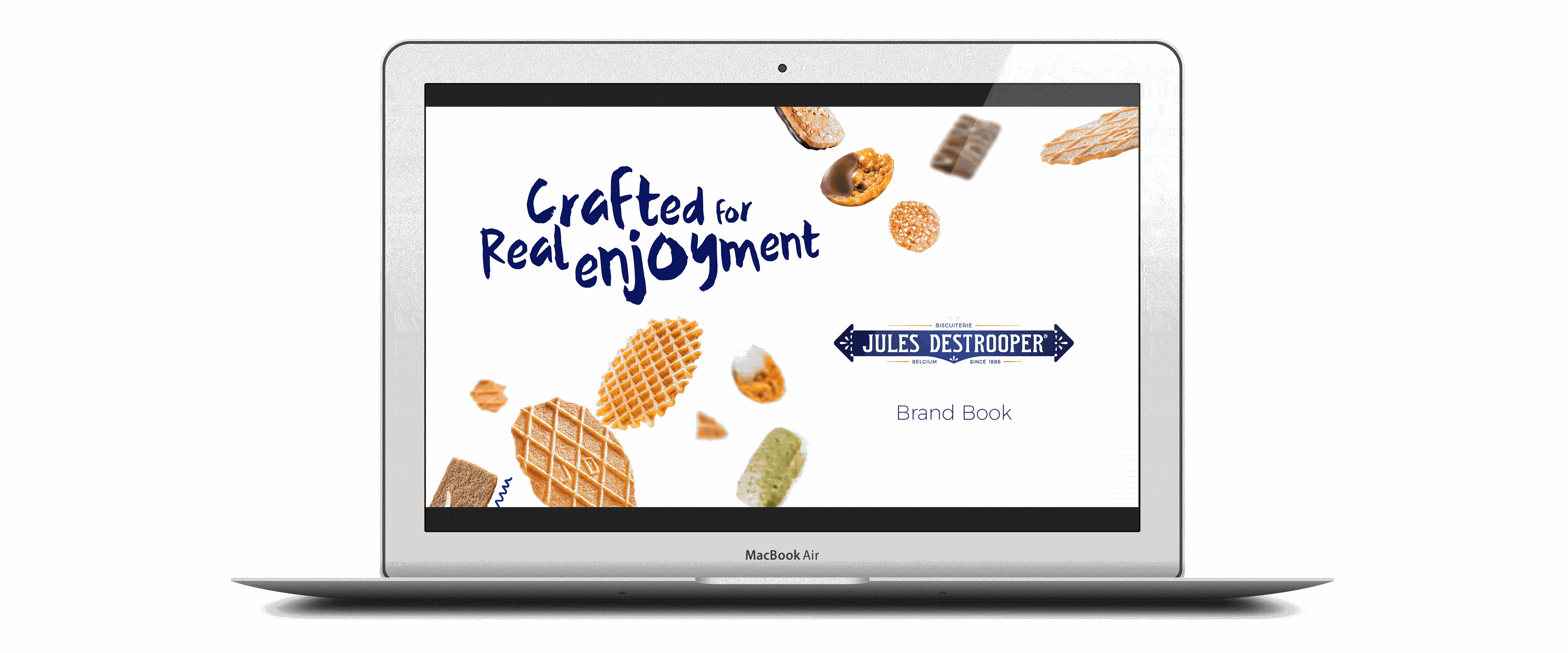
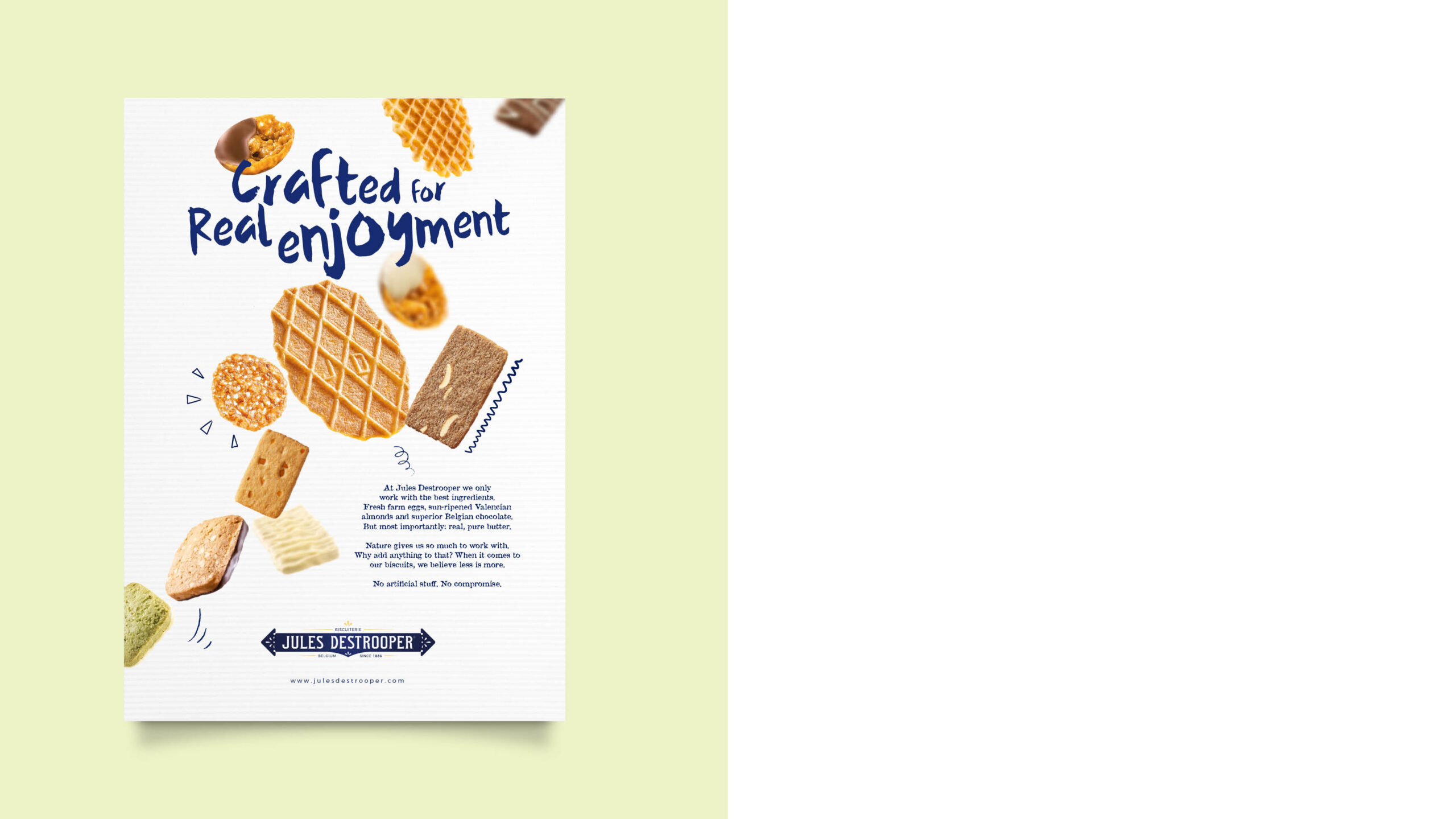
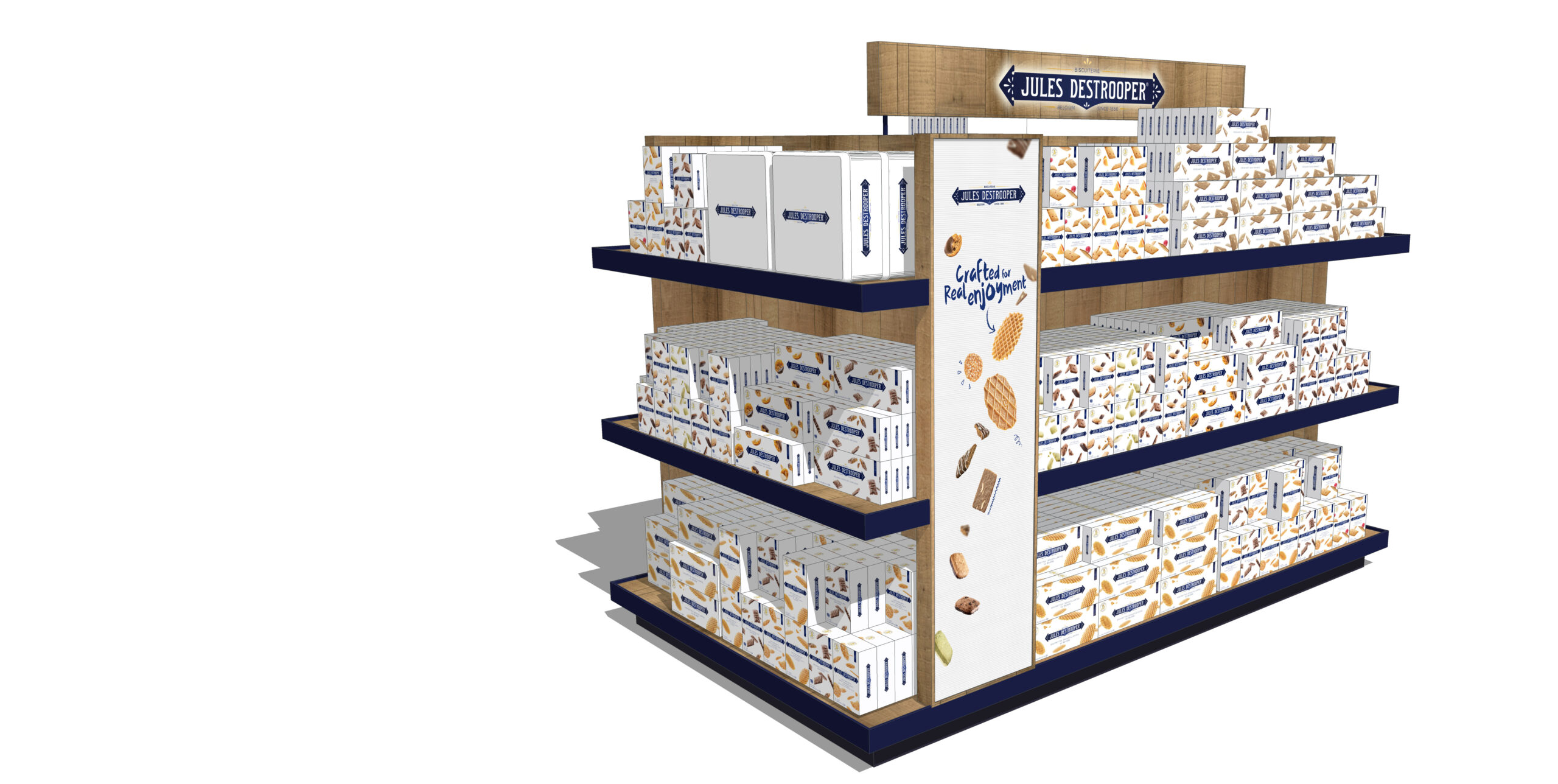
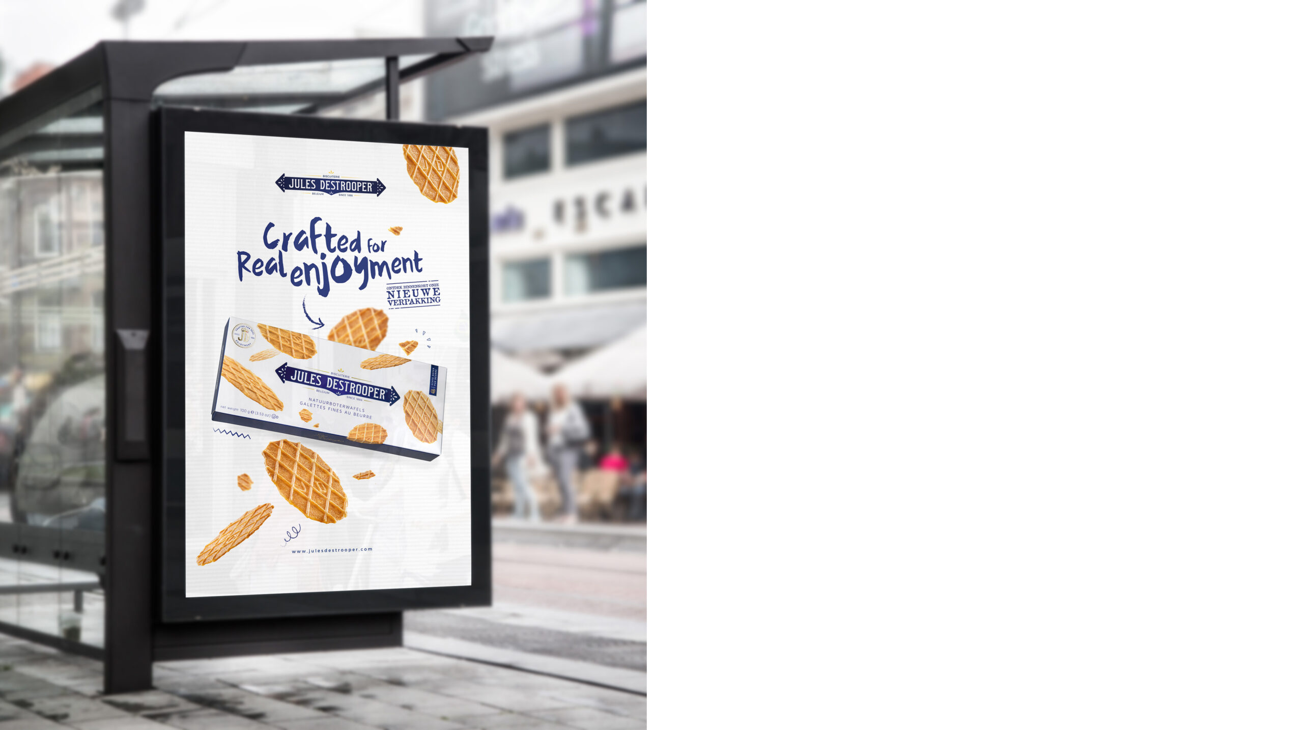
Crafted for real enjoyment.
Designing a new style for an iconic brand is no small task. Jules Destrooper is unmistakably known for its stylish white and blue packaging. Of course, it was imperative to keep this distinction. But it was also this style that had made the brand a bit dusty and distant over time — something we wanted to change!
Based on extensive research, we defined the right style elements and typography for the new visual style. The chosen font simultaneously conveys ‘young’ and ‘craft’ through its handwritten style. To add warmth to the characteristic white of Jules Destrooper’s identity, we opted for a subtle background design inspired by ribbed paper often used in biscuit packaging.
The ‘flying cookies’ give the style energy and little doodles add humour, creating a friendlier and more accessible look.
Everything was then captured in a brand book and a style guide that, in addition to technical aspects, is an inspiration to everyone who works for the brand!