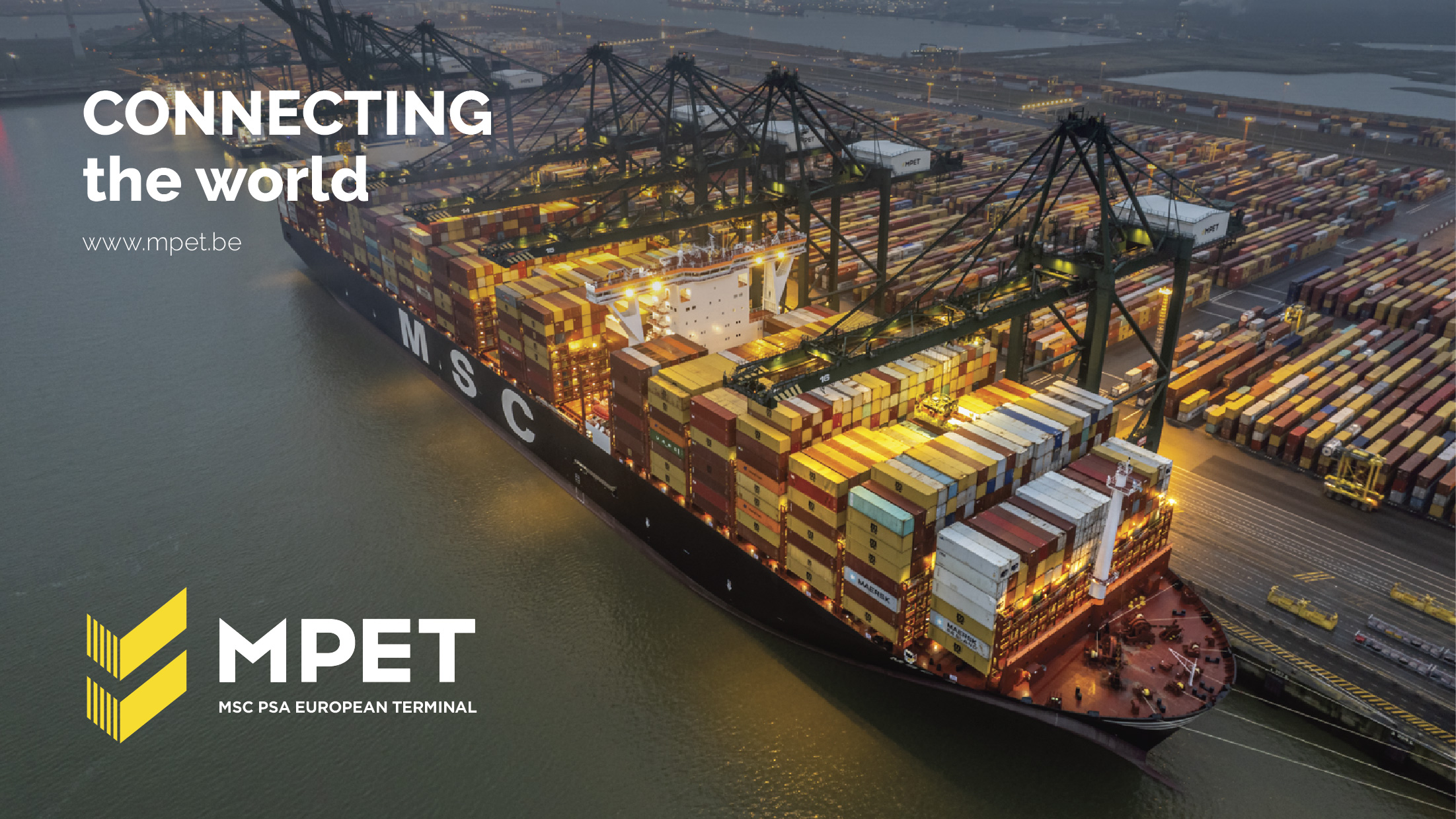
Connecting the world
MPET, a joint venture between PSA and Terminal Investment Limited (TIL), is headquartered in Singapore and operates globally. In fact, their container terminal in the port of Antwerp is the largest in Europe.
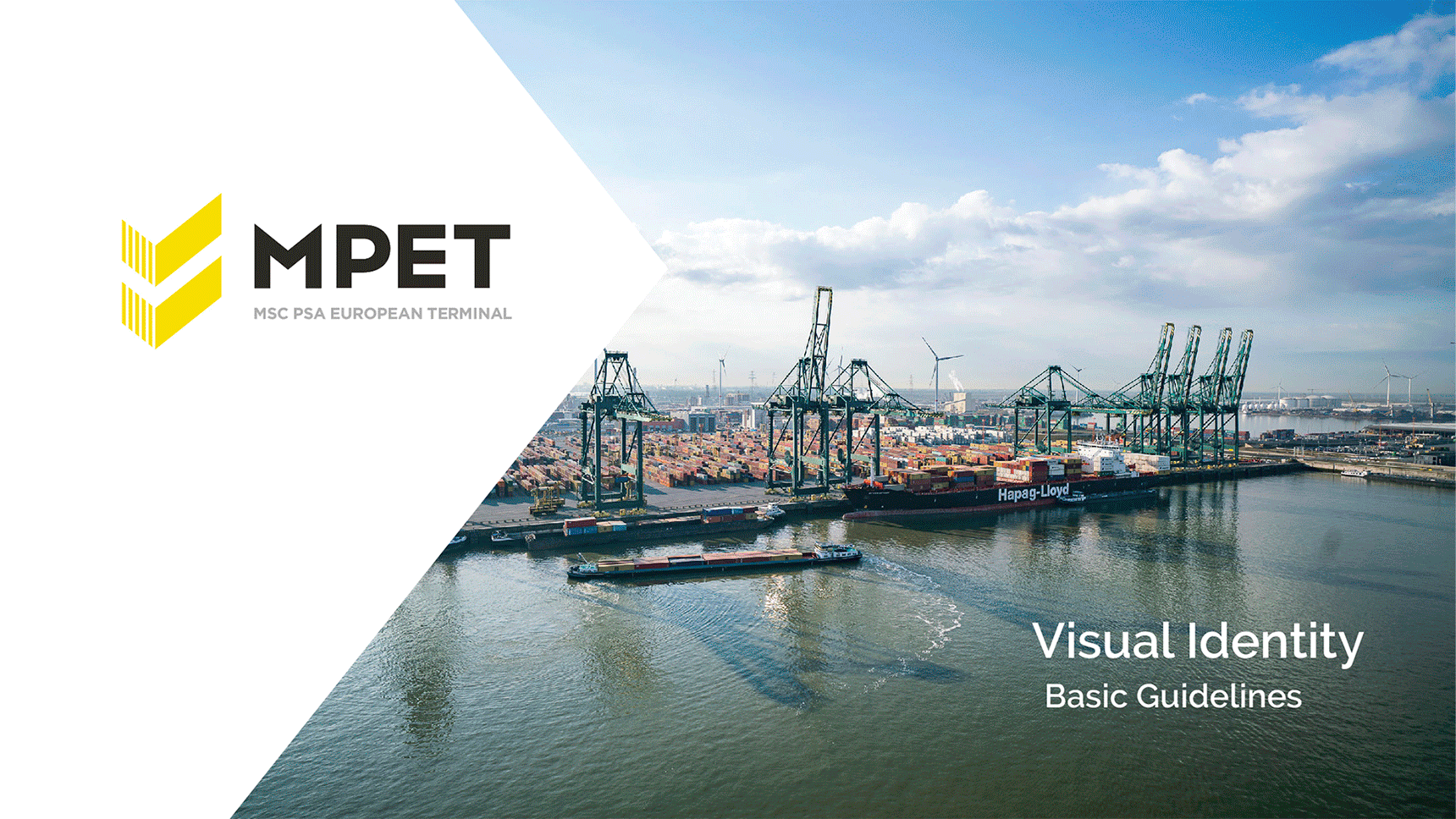
While the name MPET is known internationally, the logo did not ring a bell in the shipping world. Time for a refresh and the creation of an appropriate corporate identity that was previously lacking. The former MPET logo not only looked dated but was impractical in use. The baseline was difficult to read and the meaning behind the ‘tick marks’ was almost a mystery to everyone.
MPET engaged us for a comprehensive restyling with respect for the company’s individuality.
To do this, we first brought the logo image and the baseline into balance: all elements were given the right proportion in relation to each other. With a few dashes, we added depth to the logo and the tick marks became what they stood for: shipping containers. We also pruned the multitude of colours to make the logo more powerful and practical.
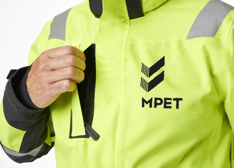
Additionally, we also worked out a complete corporate identity with different modules for each terminal worldwide. We added a fresh secondary colour palette to the primary, saturated colours, based on the colours of containers.
We applied the full corporate identity to a corporate presentation that can be used internationally. A modular template with an emphasis on user-friendliness.
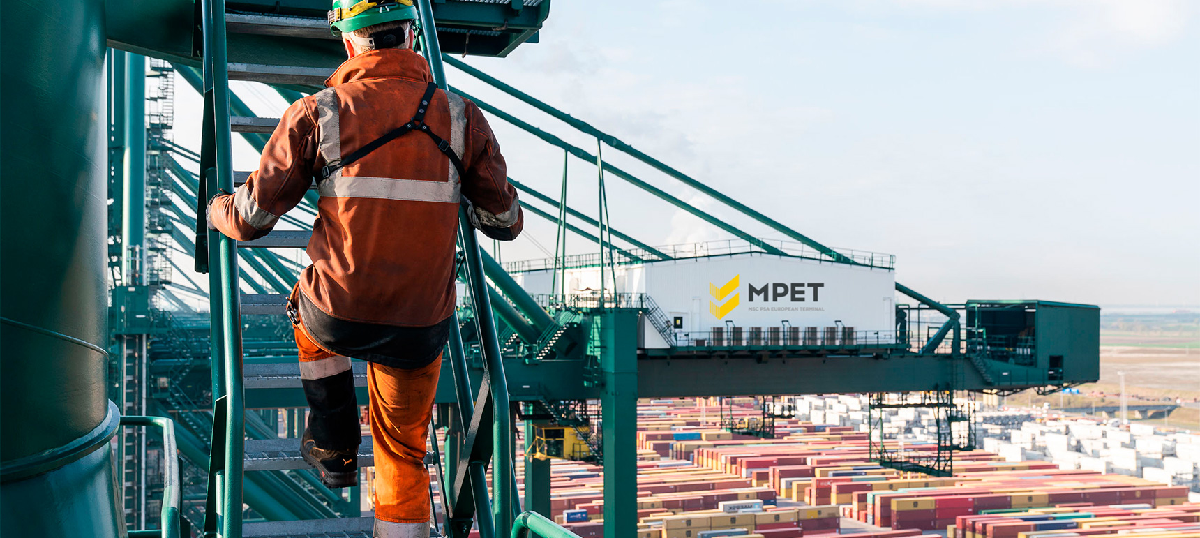
© Photography by Jasper Leonard for MPET